Friday, September 27, 2013

Artful Readers Club September - Just My Type by Simon Garfield

This month for the Artful Readers Club, I read 'Just My Type' - a non fiction book about fonts.

That sounds kind of dull, doesn't it?

But it really, really wasn't!

This book genuinely is a lot of fun to read, packed full of fascinating anecdotes about the history of typography from the 15th century Gutenberg press, to the digital modern day.

It covers beautiful fonts - powerful fonts - lost fonts - functional fonts - ugly fonts - and has a whole chapter devoted to the font everybody loves to hate, poor old 

It explains why the quick, brown fox jumped over the lazy dog, and even directs you to a youtube video of the actual event

And it will leave you thoroughly font obsessed, I can promise that you'll never look at a road sign, product packaging, or newspaper masthead in quite the same way again

In short, I can thoroughly recommend this book, it's a cracking good read.

One of my favourite chapters in the book, and the part that has inspired my art page for this month, starts with these ominous words:

Good type never dies, but there is one notable exception - Doves, the type that drowned.

It tells the story of the traditional typeface 'Doves', designed in 1900 by T.J. Cobden Sanderson, who was "a real aesthete. He thought he could invent the perfect, most beautiful type" .  It is seen in action below on a page from the Doves Bible.


Sanderson formed a publishing house that printed using Doves type, but after a major falling out, Sanderson decided that he did not want his business partner to be able to use the font after he died. So he took all the cast metal letterforms that had ever been made using the Doves typeface, and he took them to Westminster Bridge and threw them into the Thames.

This took him five months, and over a hundred separate trips to the river with his heavy bags of type, a considerable undertaking for a seventy-six year old man .... he must have REALLY been in a bad mood with his partner.

"Doves was never recovered, at least not the full alphabet.  Even now it seems likely that the disintegrating typeface is stuck firm in the riverbed, resisting both dredging and the digital age, perhaps occasionally breaking free to form its own words and sentences as fortune and the molten tide allows"


My page this month is watercoloured, with black pitt pens used for the details.

And, just for this month, here's a bonus bit of digital art - in one of the final chapters of the book, the author lists a few typographical games and apps - one of which is an iPad app called 'TypeDrawing' which looked a lot of fun, so I downloaded it.

Here's my very rough attempt at a portrait of Death (from Neil Gaiman's Sandman comics), rendered in a combination of Zapfino and Verdana-Bold.  The text is one of her quotes from the comic: "For some folks death is release, and for others death is an abomination, a terrible thing. But in the end, I'm there for all of them."


This took under 5 minutes and was a breeze - I think I'll be playing around with this app quite a lot!

Next month I'll be reading 'Selling Hitler' by Robert Harris; until then, TTFN

Monday, September 02, 2013

Always be a unicorn.....

End of the month - it must be circle journal time :)

This is my entry in Karen's CJ, her theme is something along the lines of witty sayings or quotes - so here's mine:


I painted the unicorn using acrylic paints, over a metallic background made on the gelli plate

Wording was all done (not very well!) using Posca pens

I think next month is my last one for this circle, it's been fun, I'll miss it

Friday, August 30, 2013

Artful Readers Club August - Thud! by Terry Pratchett

This month sees me back in Terry Pratchett's Discworld for the first time in a very long time.  I used to devour these books as soon as they come out, but I kind of got out of the habit and now I am trailing a bit behind.

This title is number 34 in the series (and the 34th that I have read as I've gone through them strictly in order) - and so far he is up to number 40, so I'm not too far behind, I will catch up :)

One of the things that our Terry is incredibly good at, is taking a real world situation, perhaps political or to do with the economy, and handling it satirically but with great sensitivity within the fantastical (but oh so recognisable) realm of the Discworld .....

And this book is no exception - it's essentially about racism/sectarianism - and it hits some home truths along the way - but in the usual charming and witty way, so at no point do you feel preached at

The story in a nutshell - is that the anniversary of some long forgotten battle between the dwarves and trolls is fast approaching - and the city watch are expecting trouble - and this tension is further exacerbated by the murder of a leading dwarf demagogue

Commander Vimes and his motley crew therefore need to solve the murder and keep the peace, all in a day's work for Ankh-Morpork's finest...

The book was very entertaining to read, classic Pratchett (although with slightly fewer footnotes than in the earlier books, which I missed), funny, sad, thought-provoking in equal measures.

As for my artwork this month, I've kind of messed up as this will mean absolutely zilch to anyone who hasn't read the book - but I can't explain it as it relates to a pivotal scene at the end of the story, which I can't tell you as it would be a big spoiler!


So all you need to know is that is supposed to be Sam Vimes, and he REALLY wants to know where his cow is :)  Oh - and those symbols in the background are dwarvish mining signs which crop up frequently throughout the story:


Sorry to be so vague...... you'll just have to go and read the book for it all to make sense :)

See you again next month, when I'll be reviewing Just My Type by Simon Garfield

Friday, August 02, 2013

Results of an arty collaboration with my buddies....

For a while now, mentions of the Tofu Millenia mail art project have been popping up on a lot of arty blogs - clicking on the link above will take you to a Flickr group with lots of examples.  And Tofu, the artist who started the whole thing off can be found here.

Basically, the concept is that you divide a postcard up into a number of 'strata', and it gets passed around from artist to artist until it's full up.

I kind of had this pegged as something we could maybe do as a project over at Collabor-ART, and maybe we will one day, but in the meantime, one of my pals on facebook suggested we could do a round just between us buddies, and so we did!

We all chose a theme, mine was 'copper and teal' as that's one of my favourite colour combos, and we each arted up the first layer of our postcards (well, I say postcards, we actually agreed to work at a larger size, so most of the participants went for 10"x8", mine was a little smaller).  That's how mine started off up there ^

And this is it all completed, as it came home this week - it looks so cool all filled up:


From top to bottom, me, Carmen, Sami, Jo, Susan and Virginia

And here are the contributions I made to the others:

First of all, Virginia's - her theme was red and black:


I know she loves Celtic imagery, so I drew her this design, based upon an image from the Book of Kells which I have as a tattoo (I had it done back in my Uni days, a long time ago now, when Celtic tatts were all the rage, but I still like it)

Next up - Susie, who went for Steampunk as her theme:

I went for a bit of a pun .... as I don't think there's always enough 'punk' going on in the steampunk trend

Here's my layer along with the other two that had already been filled in at that point, I love how Virginia filled in that heart with loads of tiny, real watch parts:


Jo's rainbow themed postcard was next - we were allowed to choose any colour we liked, they didn't have to be in order a la Richard of York ....  I went for green and painted a pair of envious green eyes:


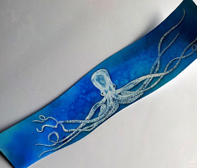
Next was Sami's - theme 'the motion of the ocean' - most people had gone with fish so I went with an octopus:


And here he is added to the card and embellished a bit in line with the previous additions:


And last, but certainly not least, Carmen's ace Edgar Allen Poe themed card - I was really hoping nobody else would have done something relating to the Tell-tale Heart, as that's my favourite Poe story - and I was lucky....

Here's my contribution:


The quote from the book reads "I admit the deed!  Tear up the planks!  Here, here!  It is the beating of his hideous heart!" - it's kind of supposed to look a bit like it was engraved into the floorboards but I'm not convinced it quite worked, never mind :)

Close up of the heart, smothered in a thick coat of Diamond Glaze - you can see the reflection from my window in it's shine....

I can almost hear it beating .....boom boom boom ..... ;)


And here it is in place with Carmen's poe-tastic postcard now complete:


This was a really fun project, let's do it again sometime girlies!

Friday, July 26, 2013

Artful Readers Club July - Black Coffee Blues by Henry Rollins

Back when Darcy first mentioned this very cool idea of hers – what’s that? an arty reading club?  I’m in! – she said that we should pick some books that had been lying around our house unread for ages and we just needed an extra incentive to pick them up and actually read them.  Straight away I knew that this book had to be on the list, and in fact it was the first one onto my ARC pile.  Because I had bought this title (along with its two brothers - Black Coffee Blues is the start of a trilogy by ex-Black Flag vocalist and spoken word maestro Rollins) yonks and yonks ago, but had been actively putting off reading it.  Why?  Because I knew it would be bleak, and tense, and quite frankly hard work, and I never seemed to be in quite the right mood to start it.


So thank you, ARC, for forcing my hand ....Because yes, the book was indeed bleak, and tense, and angry and testosterone fuelled, and downright depressing a lot of the time – but it was also fascinating, and enlightening, and even, in spots, funny.  Very much like a Henry Rollins spoken word gig, in fact ..... you can absolutely hear his voice as you read.


The book starts off with a section called 124 worlds – single paragraph glimpses into (mostly) pretty depressing lives.  A lot of them are kind of extreme, dealing with violence, abuse, dependence….. it’s a harrowing read.  Here’s a couple of the tamer ones:

#18: He goes to the same job every day.  He comes home to his wife every night.  they rarely touch.  They're not attracted to each other anymore.  Neither makes a big deal about it.  A few years ago, they would fight and swear that they were going to leave each other, but then they found that when it really came down to it, neither one had the courage to go out and meet someone else.  They don’t hate each other.  They are roommates waiting for death.

#26: School made him sick to his stomach because he had to fight all the time.  He never ran away from fights.  He got beat up a lot but he did win some.  It seemed like every time he turned around, there was someone in his face trying to start something with him.  He used to get up hours before school because his guts would be on fire getting ready to face them.  One great day he punched this guy just right.  A broken nose is a many splendoured thing.  This guy’s face just exploded.  It was like a rainbow – but all the colours were red.

The other main section - with the rest of the book taken up with dream diaries, poems and short essays - is Henry's tour diary from a European tour in the late 80s.  I saw the Rollins Band a couple of times on that tour, so it’s very interesting to read his journal entries from the time.  The diaries are very personal – I’m pretty sure he didn’t have publication in mind when he first wrote them, and are a real window on the mind of a touring musician – dealing with the endless parade of soulless hotel rooms, the boredom, the loneliness, but also the joy and energy of performing, which makes it all worthwhile.

So – all in all – I loved this book, but I won’t be rushing straight into reading the other two books in the series.  I want to read something happy and uplifting first :D

For the art page to accompany my review, I used part of another favourite quote from the book, our Hank really has a way with words:

"How memories lie to us. How time coats the ordinary with gold. How it breaks the heart to go back and attempt to re-live them. How crushed we are when we discover that the gold was merely gold-plating thinly coated over lead, chalk and peeling paint"


I used the Summer of Colour week 5 combo for this one - pale pink and charcoal grey - using a coral stencil for the background (I was going for the look of a brain, as Henry certainly has a big one of those, as well as a big mouth!)

Next month I'll be reading Thud! by Terry Pratchett - so I'll see you again then, my fellow ARCers!

Saturday, July 13, 2013

Time for a bloggy catch up

I've neglected this poor old blog recently, haven't I....... no "Rocking Your World" or "A Year of Firsts" posts since March, and half the stuff I make doesn't get onto the blog any more either.

Sorry peeps, it's all down to wok craziness, it's been such a busy year and I've been working silly hours, so a lot of my free time activities, including keeping my blog up to date, have had to give

But anyway, enough excuses, here are a few things I've made recently that I haven't put on here yet:

First up, I've been taking part in the Summer of Color challenge this year - and a few of the bits you'll have seen already, but here are two you haven't:

Week one - colour combo Citron Green & Turquoise - I made a batch of gelli prints and then used one of them to make my dad's Fathers' Day card:


Week two - Hot Pink & Orange - I used on a CJ entry already blogged here

Week three - Lime Green & Purple - well purple always makes me think of chocolate thanks to Cadbury :)  so I used this combo for my Hollow Chocolate Bunnies book review artwork, already blogged here

Week four - Charcoal Grey & Pale Pink - I can't share that one yet as it's on the artwork for my next ARC book review, but watch this space!

Week five - Candy Apple Red & Yellow - I made something for myself to keep for a change.  I bought this wooden plaque a while ago in the Works for £1.99, and used it to make a bit of tribute fan art to the wondrous webcomic Romantically Apocalyptic


Any of you who haven't checked out RA yet - do it now!!!  Head for the archives and read it from the beginning or it won't make sense.  Well, it doesn't make much sense anyway :) But it is so funny and beautiful and just brilliant.  What are you waiting for?  go!   (but do come back here afterwards and finish reading this blog post :) )

The week six combo is looking likely to be Sage & Sepia, not sure yet what I'll do for that one....

What else haven't I blogged?  This ICAD portrait of my cat:


And this CJ entry:


(I cut that 4 layer stencil of the Krays by hand, it gave me a knife finger blister! more details over here)

I think there are probably other things I've forgotten to blog, but that's a reasonable attempt to catch up.....

Thursday, July 04, 2013

Trapped in the amber of this moment....

I'm a proper girly swot this month, as I've finished my entry in Sian's art journal CJ already, and it isn't due to go in the post until 1st August. Which is most unlike me, I am usually a stay-up-till-3am-the-day-before-the-deadline-to-get-it-finished kind of a girl

The theme of Sian's CJ is 'word play' - she has provided a list of words from which each participant chooses a word (or two) to illustrate.   In that respect it's a little bit like the pair journal I'm doing with Shirley (which I haven't blogged about on here for yonks, but it is still ongoing, the latest update is over at Collabor-ART)

Sian has some awesome words on her list - lots of nice happy ones, but also lots of cool angsty words like 'fear' and 'addiction' and 'alienation' - and being the horror movie/rock/metal/comic book fan that I am, I was more drawn to the darker words.  In the end I decided to illustrate the word 'trapped':


Sci-fi fans might recognise the quotation, it's from Kurt Vonnegut's classic Slaughterhouse-Five:

"Why you? Why us for that matter? Why anything? Because this moment simply is. Have you ever seen bugs trapped in amber? . . . Well, here we are, Mr. Pilgrim, trapped in the amber of this moment. There is no why." 

To give the illusion of poor Billy Pilgrim being trapped in amber, I sprayed the central section with a couple of coats of glossy varnish:


I did want to give him a little hope though, so I stamped the crackles on top with white paint to show that the amber is starting to break, maybe he'll escape from this moment soon enough....

Finally we were asked to make a matching tag for our sign in:


I've used a lot of stamps this time around, which was kind of fun, it's a while since I've played with my rubber :)  The crime scene tape is from Viva Las Vegas, the corrugated iron background is by Darkroom Door, the round Circle Journal stamp is by Cats Life Press, all the crackles are from a cube by Stampers Anonymous, and I think the woodgrain that I used for my planks is by All Night Media

The man was painted by me, though.

I do hope that Sian likes it, and that it hasn't overly spoilt the mood of an otherwise pretty and uplifting journal!

So it goes.....

Friday, June 28, 2013

Artful Readers Club June - The Hollow Chocolate Bunnies of the Apocalypse by Robert Rankin

It's time for another artful read - and I'm glad to be here, as I wasn't entirely sure I'd be finished in time to take part this month - but I made it by the skin of my teeth - hooray!

Part of the delay was down to reading the book late in the month .... my original planned title for June was another Robert Rankin book - the Toyminator - but when I picked it up to start it, I discovered it was actually the second book in a two-parter.

Not wanting to read part 2 before part 1, I ordered the original - the Hollow Chocolate Bunnies of the Apocalypse - online, but it didn't arrive until mid June, which put me on the back foot.

Luckily it was a fairly quick read, and I just about had time to write this review and whip up my art piece, and so here I am :)

This is, apparently, Robert Rankins's 24th book - I had no idea he had written so many! I have read and enjoyed many (but it seems, nowhere near all) of his books in the past - and particularly enjoyed what I have read from the Brentford Trilogy (which is somewhat of a misnomer as I believe there are 9 books in that particular series so far!)

Rankin is the master of humorous (bordering on downright silly), fantasy fiction, full of bad puns and running gags and surreal situations.  And this book was no different.

It had all of the classic Rankin trademarks, it was an enjoyable enough read, and I'm definitely going to read the sequel, but I have to be honest, it was not my absolute favourite of his books.

I'm putting that down to the setting - usually his books are set in a fairly realistic and recognisable urban kind of environment, populated largely by fairly realistic and recognisable human characters, even if the story itself veers far from realism.  But this book is set in Toy Town, the lead character is a talking teddy bear, and most of the other lead roles are filled by either other toys, or nursery rhyme characters.

I had a similar problem when another of my favourite authors, Jasper Fforde, set a book in a nursery rhyme environment.  Maybe I just prefer my crazy surreal fantasy stories to be a little more relatable?? (and yes, I know that makes no sense)

But, don't let me put you off, it was a funny book, well plotted, there's a serial killer on the loose in Toy Town and our heroes solve the case and save the day and have some fun adventures along the way.  I can't really fault the book other than to say that the author's other books are even better!

So - in summary - read the Brentford Trilogy instead :D

For my accompanying artwork this month, I painted one of the eponymous chocolate bunnies (he's supposed to look a bit evil, with his devil's eye, but instead he ended up looking equal parts cute and delicious, but not particularly menacing....).  And then I added one of the classic Rankin running gags ("it must be a tradition, or an old charter or something" - which appears in all his books at least once, I counted two times in this one) using hand drawn 'word art':


Next month I'll be reading Black Coffee Blues by Henry Rollins, a total change of pace from what I've read the past few times - see you again in late July .....

Saturday, June 22, 2013

Overworked, over tired and over here....


So - can you guess what kind of week I've had? :)

This is my entry in Jo's book for the 'You're Having a Laugh' art journal CJ - her theme is 'How Do You Feel Today?' .... I wonder if she is going to regret asking that question :D

I actually found it quite stress relieving painting my stressed out lady, the therapeutic powers of art strike again!

As a few peeps have said they like seeing the step by steps, here's how she came about:

Sketched onto a gelli print with a grey pitt pen, shirt, teeth and eyes coloured in with a white paint pen, skin painted with Fresco acrylic paint in Nougat
More painting - all Fresco paints - Squid Ink, Claret and Pansy on the jacket, French Roast and a touch of Hyde Park in the eyes
Very Berry and London Red on the lips and tongue, and the hair was a mix of French Roast, Chocolate Pudding and Cinnamon
After this point I finished off her hair, added the punched arrows all around the page as a frame, and wrote the page title 'Stressed!' using paint pens.

Here's hoping for a reduction in day job workload and stresses very soon and more time for arty pursuits!

Thursday, June 13, 2013

It's ICAD time again!

You might remember that this time last year I took part in Daisy Yellow's Index Card A Day challenge - to make some kind of small artwork on an index card every day for 2 months.

My kids joined in too, and even my other half did a couple, and we ended up with this fantastic wall of creativity:


I did all 61 cards last year over June and July, and I wish I was in a position to do so this year, but work is crazy busy :(

So instead this year I have set myself the task of still doing 61 index cards, but over as much time as it takes (ie not within the 2 months)

And rather than doing all sorts of different styles and subjects like I did last year, I'm going to use this as an exercise to improve my portraits - and paint 61 faces, men, women, children, maybe even animals, with different facial expressions.  It's all good practice.

So here is the start of this year's ICAD wall:


I found the child's face particularly hard - he was supposed to look cheeky and adorable, not evil :)

And the profile pic top right is based on an old photo of my school friend Jo, and I struggled to capture her likeness to my liking, 

but I am pleased with the two on the left.

A 50:50 success rate on my first 4 cards isn't too shabby I guess? :)  i hope I can keep that up over the remaining 57!

Friday, May 31, 2013

Artful Readers Club May - Rivers of London by Ben Aaronovitch

It's reading club time again, and I have a glowing review for you this time around as I loved this month's book!

I've actually had this one - and its sequel Moon Over Soho - on my bedside table for well over a year, waiting to be read.  I'm glad I finally got around to it :)

The blurb on the cover would have you believe that this is a kind of "Harry Potter for grown ups", but it really isn't.  Yes, there's a trainee wizard in the mix, but other than that, there's very little similarity.

It's much funnier, for a start, and much more gritty and real - which is impressive for a book chock full of magical creatures and gods.  Sometimes you almost forget about all the spooks and spells as you enjoy the solid police procedural elements of the story.

The characters are likeable, the intertwining stories are entertaining, it's very well written, and it really is just plain fun.  What more could you ask for?

And one of the things I loved most about the book is that it feels almost like a love letter to London in parts, and I love London too, it's where I grew up, and even though I have now moved away, we go back to visit often.  So I enjoyed reading such fond words about my old stomping grounds :)

For my artwork, I have chosen to illustrate my favourite minor character from the books, Molly, the maid servant of indeterminate age and species......  here's her introduction from the opening stages of the story:

"How many people live here?" I asked.
"Just the two of us.  And Molly" said Nightingale.
Toby suddenly crouched down at my feet and growled, a proper rat-in-the-kitchen growl that was all business.  I looked over and saw a woman gliding towards us across the polished marble.  She was slender and dressed like an Edwardian maid, complete with a starched white bib apron over a full black skirt and white cotton blouse.  Her face didn't fit her outfit, being too long and sharp-boned with black, almond-shaped eyes.
Despite her mob cap she wore her hair loose, a black curtain that fell to her waist.  She instantly gave me the creeps, and not just because I've seen too many Japanese horror films.
"This is Molly," said Nightingale.  "She does for us".
"Does what?"
"Whatever needs doing" said Nightingale.
Molly lowered her eyes and did an awkward little dip that might have been a curtsey or a bow.  When Toby growled again Molly snarled back, showing disturbingly sharp teeth.
"Molly" said Nightingale sharply.
Molly demurely covered her mouth with her hand, turned and went gliding back the way she came.  Toby gave a little self-satisfied snort that didn't fool anyone but himself.
"And she is....?" I asked.
"Indispensable" said Nightingale.

And here's my painting of her:


Everything on here is acrylic paints - the background and the city skyline were monoprinted using a gelli-plate, the Thames was drawn on with a Molotow paint pen, and Miss Molly from the Folly was painted freehand, loosely based on that spooky girl from the Ring movie....

I've just realised she was supposed to be wearing a white blouse.  Oh well, close enough :)

Next month I will be reading The Toyminator by Robert Rankin, which I have just realised is a sequel and I haven't read the first book yet.  Oops.  Maybe I should get the first book and read that instead.....would that be allowed in the rules, Darcy?

Thursday, May 23, 2013

Spacey-wacey Timey-wimey


Well, OK, not so much on the timey-wimey.  But recently I have re-discovered the fun of making space art with spray paints.

It really is super easy, and quick, and almost magical in the way it works

^ That one up there was my very first attempt last year after watching some "how to" videos on You Tube.  The kids made their own too and got equally ace results, you can't mess it up even if you try.

Then a couple of weeks ago, I made a CJ page based on Shakespeare's Sister's "Stay" - such a great song and brilliant video too - which was positively crying out for a space art background

Here's the end result:


(blogged in full at Collabor-ART here: http://collabor-art.blogspot.co.uk/2013/05/time-for-another-round-of-desert-island.html)

And then today I was working on another CJ page - this one had movie/TV show quotes as its theme, and I happen to know that the journal's originator is a big fan of Star Trek, especially the original series - so I couldn't resist attempting a portrait of Mr Spock:


And of course he absolutely NEEDED a space background:


So here's how it works.....

First of all you spray a colour, then black then white spray paints in quick succession (without letting the paint dry) roughly where you want your planets to be.

Then you take a slightly crumpled bit of thin paper (a magazine page works well), and put it down over the paint then peel it straight back off.  This is what leaves that fantastic "planet surface" texture:


Spray in a little shadow with black paint on the "dark side of the moon" and then pop round objects (that you don't mind ruining!) in place to make the planets.

Spray all over with black, then add a little bright blue and yellow space dust, and white stars (shaking the can about while only partially depressing the nozzle will give that nice splattery effect)


When the paint is dry, lift off your round thingamajigs, and ta-da:

It's as easy as that!

If you have spray paints handy (the graffiti-style paints in aerosol cans, not spray inks) then I totally urge you to have a go at this, it really is so much fun!


Live Long and Prosper, guys....