Thursday, May 08, 2014

the Lost Dogs are born.....


I really enjoyed making the postage stamp head Artist Trading Cards a week or so back – I fancy making a few more - but in the meantime I came across these two Polish cat head stamps which are a little too large for ATCs, and thought they might work better on small canvasses

So here you go – they are on 5” x 7” canvas board, the backgrounds are a combination of spraypaints and gelli-printed acrylics – and the cat bodies were painted with acrylics and edged with water soluble graphite

I think they work well together as a pair, but whether they stay together or end up in separate homes depends on how eagle-eyed the finder(s) are – as these two canvasses are being Free Art Friday’d next week :)   Happy hunting, Swindonites!


**edited a week later to add two more :


These two are currently on the wall at Gallery 87 in Bristol - the gallery owner has bagsied the cat :)  but the dog is waiting for someone to take a closer look at which point they will be gifted him, Free Art Friday stylee

I've come up with a name for these little critters, the Lost Dogs (and yes, I know so far 75% of them are cats :) )

You can follow their antics on their own Facebook page:  https://www.facebook.com/TheLostDogsArt

Sunday, May 04, 2014

Catch up time

Just a few bits to catch up on this month, first up, here is my entry for the April installment of the Stay At Home CJ .....


The theme this month was "art in my heart", and this was the background we had to work on:

I went for the broken hearted angle on the theme, as I wanted to play with my lovely purple Bombay ink to make those lush drips :)

You can see the full gallery with everyone's interpretations of the theme over at Collabor-ART

Something else I've been having fun with over the last couple of weeks is making "missing" juice boxes for Free Art Friday style drops.  

These two:


were the first couple I made.  I really need to work on neatening up my lettering!  And the whole concept would probably work better with milk cartons than juice cartons - but I don't drink milk :/    Other than that I think they work :)

These were dropped at the St. Athans Boys Village in South Wales:


I hope whoever found them enjoyed them!

(for those of you who are interested, there are lots more photos of this amazing place in this Facebook album from piccie #141 onwards)

Thursday, May 01, 2014

First ATCs I have made in an age

I forgot how little and fiddly they are :)

These are for a postage stamp based Artist Trading Card swap over at UKScrappers

I've really enjoyed making these, I only needed to do 5 for the swap but I can see myself carrying on and making more as they were a lot of fun

So if anyone fancies a direct trade for something similar, let me know!


Wednesday, April 09, 2014

Catch up time

I have really lost the knack for this whole blogging lark - as in I have no idea what to actually WRITE - but here are some pretty pictures of stuff wot I have been doing recently....

First of all, over there on the left, I'm pretty proud of this one.

It's a painting of Matthew the Raven (from the Sandman comics) - he took me months as he’s a big old fella (about 5 feet tall, see blurry pic of me below for scale) – and I thought I might never get him finished.  But I got there in the end – yay! - and I have proudly hung him at the top of the stairs.


Next up, a couple of circle journal pages:


This first one was for the Stay At Home CJ over on Collabor-Art – the theme was Mermaid Tales ….. you can see the whole gallery of everyone else’s entries here

And the second was for the Fabric CJ I’m a part of over at UKScrappers.  The theme, as you might have guessed, was cupcakes.  Very much not my usual style this one!  But I enjoyed the needle felting element, it’s always fun to get stabby!!


Tuesday, April 01, 2014

Day of the Paintbrush

Well, it's a long long time since I last took part in a UKScrappers swap - but the challenge "take an old decorator's paint brush, stick a face on it, and decorate it Day of the Dead sugar skull style" was just too tempting to pass up!!

So here's an in progress pic:

(the skull was sculpted from air dry clay)


And here, after many hours doodling with my trusty Posca paint pens, is the end result:

This will go in the post this week, I hope his forever owner likes him and doesn't find him too creepy!

Monday, March 03, 2014

Another circle journal update....

I've done a couple more CJ entries since the last time I blogged, so for the sake of completeness, here they are (apologies this won't be a wordy post, I am soooooo tired and my bed beckons :) ):


This one had a Shakespeare theme, so I did a portrait of Titania and her beloved Bottom from A Midsummer Night's Dream


The theme for this one was Innocence and Experience....

And finally, this month's "Bestitched" fabric CJ entry - the theme was 'bejewelled' .... which made me think of jewel toned fabrics and sari silks, and paisley motifs....

So I hand cut a paisley stencil (fiddly little bugger!):


And then sewed together strips of fabric in jewel tones as a base for the stencilling:


A smattering of sparkles finished it off


Sunday, January 26, 2014

Circle Journal catch ups

I haven't blogged since last September??? Blimey!  Didn't realise it had been that long!

So - anyway - here's a catch up on my current CJs

First up, my first entry for a new fabric based CJ taking place over on UKScrappers.  My theme is tattoos, and I've asked each participant to make a 8" x 8" mini art quilt:


That blooming swallow took me two weeks to embroider, and not all the stitching is perfect, but I am fairly pleased with the end result.  I look forward to the next six months, some of the themes are going to be a bit of a challenge for me I think, but that's why I enjoy CJs, I like being forced out of my comfort zone a bit.....

Next, and I'm not sure why I haven't blogged any of these already, I've been taking part for the last few months in a very different kind of CJ over at Collabor-art.  It's called a Stay At Home CJ, and the basic premise is that each person taking part has made a background, and chosen a theme - we all have been sent colour copies of the ten backgrounds, and each month we all work on the same background, to the same theme, blind.  There's a big reveal at the end of each month of what everyone did.  And the big plus points are that 1) there's no postage costs or the worry of things getting lost in the post and 2) you get to keep all your artwork

Here are my entries to date, and links to the Collabor-art posts for each month so you can see what everyone else did from the same starting point:

Month 1, theme "for the love of trees":

Original background, by Lou
My entry - the quote is Emily Bronte if I remember rightly
Full gallery here

Month 2, theme "Beastie":

Background by Carmen
My entry - Cthulhu
Full gallery here

Month 3, theme "steampunk":

Background by Pat
My entry - this was a 2 layer hand cut stencil which rather annoyingly fell apart on first use, so this is a one off!
Full gallery here

And last one for now (I'm currently working on Month 5), Month 4, theme "song lyrics":

Background by me
My entry - the lyrics are from Cochise by Audioslave
Full gallery here

Phew, that was quite the update, I'll try not to leave it so long next time....

Friday, September 27, 2013

Artful Readers Club September - Just My Type by Simon Garfield

This month for the Artful Readers Club, I read 'Just My Type' - a non fiction book about fonts.

That sounds kind of dull, doesn't it?

But it really, really wasn't!

This book genuinely is a lot of fun to read, packed full of fascinating anecdotes about the history of typography from the 15th century Gutenberg press, to the digital modern day.

It covers beautiful fonts - powerful fonts - lost fonts - functional fonts - ugly fonts - and has a whole chapter devoted to the font everybody loves to hate, poor old 

It explains why the quick, brown fox jumped over the lazy dog, and even directs you to a youtube video of the actual event

And it will leave you thoroughly font obsessed, I can promise that you'll never look at a road sign, product packaging, or newspaper masthead in quite the same way again

In short, I can thoroughly recommend this book, it's a cracking good read.

One of my favourite chapters in the book, and the part that has inspired my art page for this month, starts with these ominous words:

Good type never dies, but there is one notable exception - Doves, the type that drowned.

It tells the story of the traditional typeface 'Doves', designed in 1900 by T.J. Cobden Sanderson, who was "a real aesthete. He thought he could invent the perfect, most beautiful type" .  It is seen in action below on a page from the Doves Bible.


Sanderson formed a publishing house that printed using Doves type, but after a major falling out, Sanderson decided that he did not want his business partner to be able to use the font after he died. So he took all the cast metal letterforms that had ever been made using the Doves typeface, and he took them to Westminster Bridge and threw them into the Thames.

This took him five months, and over a hundred separate trips to the river with his heavy bags of type, a considerable undertaking for a seventy-six year old man .... he must have REALLY been in a bad mood with his partner.

"Doves was never recovered, at least not the full alphabet.  Even now it seems likely that the disintegrating typeface is stuck firm in the riverbed, resisting both dredging and the digital age, perhaps occasionally breaking free to form its own words and sentences as fortune and the molten tide allows"


My page this month is watercoloured, with black pitt pens used for the details.

And, just for this month, here's a bonus bit of digital art - in one of the final chapters of the book, the author lists a few typographical games and apps - one of which is an iPad app called 'TypeDrawing' which looked a lot of fun, so I downloaded it.

Here's my very rough attempt at a portrait of Death (from Neil Gaiman's Sandman comics), rendered in a combination of Zapfino and Verdana-Bold.  The text is one of her quotes from the comic: "For some folks death is release, and for others death is an abomination, a terrible thing. But in the end, I'm there for all of them."


This took under 5 minutes and was a breeze - I think I'll be playing around with this app quite a lot!

Next month I'll be reading 'Selling Hitler' by Robert Harris; until then, TTFN

Monday, September 02, 2013

Always be a unicorn.....

End of the month - it must be circle journal time :)

This is my entry in Karen's CJ, her theme is something along the lines of witty sayings or quotes - so here's mine:


I painted the unicorn using acrylic paints, over a metallic background made on the gelli plate

Wording was all done (not very well!) using Posca pens

I think next month is my last one for this circle, it's been fun, I'll miss it

Friday, August 30, 2013

Artful Readers Club August - Thud! by Terry Pratchett

This month sees me back in Terry Pratchett's Discworld for the first time in a very long time.  I used to devour these books as soon as they come out, but I kind of got out of the habit and now I am trailing a bit behind.

This title is number 34 in the series (and the 34th that I have read as I've gone through them strictly in order) - and so far he is up to number 40, so I'm not too far behind, I will catch up :)

One of the things that our Terry is incredibly good at, is taking a real world situation, perhaps political or to do with the economy, and handling it satirically but with great sensitivity within the fantastical (but oh so recognisable) realm of the Discworld .....

And this book is no exception - it's essentially about racism/sectarianism - and it hits some home truths along the way - but in the usual charming and witty way, so at no point do you feel preached at

The story in a nutshell - is that the anniversary of some long forgotten battle between the dwarves and trolls is fast approaching - and the city watch are expecting trouble - and this tension is further exacerbated by the murder of a leading dwarf demagogue

Commander Vimes and his motley crew therefore need to solve the murder and keep the peace, all in a day's work for Ankh-Morpork's finest...

The book was very entertaining to read, classic Pratchett (although with slightly fewer footnotes than in the earlier books, which I missed), funny, sad, thought-provoking in equal measures.

As for my artwork this month, I've kind of messed up as this will mean absolutely zilch to anyone who hasn't read the book - but I can't explain it as it relates to a pivotal scene at the end of the story, which I can't tell you as it would be a big spoiler!


So all you need to know is that is supposed to be Sam Vimes, and he REALLY wants to know where his cow is :)  Oh - and those symbols in the background are dwarvish mining signs which crop up frequently throughout the story:


Sorry to be so vague...... you'll just have to go and read the book for it all to make sense :)

See you again next month, when I'll be reviewing Just My Type by Simon Garfield

Friday, August 02, 2013

Results of an arty collaboration with my buddies....

For a while now, mentions of the Tofu Millenia mail art project have been popping up on a lot of arty blogs - clicking on the link above will take you to a Flickr group with lots of examples.  And Tofu, the artist who started the whole thing off can be found here.

Basically, the concept is that you divide a postcard up into a number of 'strata', and it gets passed around from artist to artist until it's full up.

I kind of had this pegged as something we could maybe do as a project over at Collabor-ART, and maybe we will one day, but in the meantime, one of my pals on facebook suggested we could do a round just between us buddies, and so we did!

We all chose a theme, mine was 'copper and teal' as that's one of my favourite colour combos, and we each arted up the first layer of our postcards (well, I say postcards, we actually agreed to work at a larger size, so most of the participants went for 10"x8", mine was a little smaller).  That's how mine started off up there ^

And this is it all completed, as it came home this week - it looks so cool all filled up:


From top to bottom, me, Carmen, Sami, Jo, Susan and Virginia

And here are the contributions I made to the others:

First of all, Virginia's - her theme was red and black:


I know she loves Celtic imagery, so I drew her this design, based upon an image from the Book of Kells which I have as a tattoo (I had it done back in my Uni days, a long time ago now, when Celtic tatts were all the rage, but I still like it)

Next up - Susie, who went for Steampunk as her theme:

I went for a bit of a pun .... as I don't think there's always enough 'punk' going on in the steampunk trend

Here's my layer along with the other two that had already been filled in at that point, I love how Virginia filled in that heart with loads of tiny, real watch parts:


Jo's rainbow themed postcard was next - we were allowed to choose any colour we liked, they didn't have to be in order a la Richard of York ....  I went for green and painted a pair of envious green eyes:


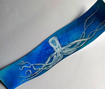
Next was Sami's - theme 'the motion of the ocean' - most people had gone with fish so I went with an octopus:


And here he is added to the card and embellished a bit in line with the previous additions:


And last, but certainly not least, Carmen's ace Edgar Allen Poe themed card - I was really hoping nobody else would have done something relating to the Tell-tale Heart, as that's my favourite Poe story - and I was lucky....

Here's my contribution:


The quote from the book reads "I admit the deed!  Tear up the planks!  Here, here!  It is the beating of his hideous heart!" - it's kind of supposed to look a bit like it was engraved into the floorboards but I'm not convinced it quite worked, never mind :)

Close up of the heart, smothered in a thick coat of Diamond Glaze - you can see the reflection from my window in it's shine....

I can almost hear it beating .....boom boom boom ..... ;)


And here it is in place with Carmen's poe-tastic postcard now complete:


This was a really fun project, let's do it again sometime girlies!