


That sounds kind of dull, doesn't it?
But it really, really wasn't!
This book genuinely is a lot of fun to read, packed full of fascinating anecdotes about the history of typography from the 15th century Gutenberg press, to the digital modern day.
It covers beautiful fonts - powerful fonts - lost fonts - functional fonts - ugly fonts - and has a whole chapter devoted to the font everybody loves to hate, poor old

It explains why the quick, brown fox jumped over the lazy dog, and even directs you to a youtube video of the actual event
And it will leave you thoroughly font obsessed, I can promise that you'll never look at a road sign, product packaging, or newspaper masthead in quite the same way again
In short, I can thoroughly recommend this book, it's a cracking good read.
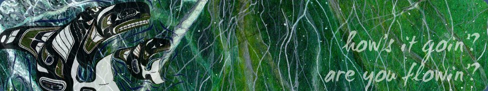
One of my favourite chapters in the book, and the part that has inspired my art page for this month, starts with these ominous words:
Good type never dies, but there is one notable exception - Doves, the type that drowned.
It tells the story of the traditional typeface 'Doves', designed in 1900 by T.J. Cobden Sanderson, who was "a real aesthete. He thought he could invent the perfect, most beautiful type" . It is seen in action below on a page from the Doves Bible.

Sanderson formed a publishing house that printed using Doves type, but after a major falling out, Sanderson decided that he did not want his business partner to be able to use the font after he died. So he took all the cast metal letterforms that had ever been made using the Doves typeface, and he took them to Westminster Bridge and threw them into the Thames.
This took him five months, and over a hundred separate trips to the river with his heavy bags of type, a considerable undertaking for a seventy-six year old man .... he must have REALLY been in a bad mood with his partner.
"Doves was never recovered, at least not the full alphabet. Even now it seems likely that the disintegrating typeface is stuck firm in the riverbed, resisting both dredging and the digital age, perhaps occasionally breaking free to form its own words and sentences as fortune and the molten tide allows"

My page this month is watercoloured, with black pitt pens used for the details.
And, just for this month, here's a bonus bit of digital art - in one of the final chapters of the book, the author lists a few typographical games and apps - one of which is an iPad app called 'TypeDrawing' which looked a lot of fun, so I downloaded it.
Here's my very rough attempt at a portrait of Death (from Neil Gaiman's Sandman comics), rendered in a combination of Zapfino and Verdana-Bold. The text is one of her quotes from the comic: "For some folks death is release, and for others death is an abomination, a terrible thing. But in the end, I'm there for all of them."

This took under 5 minutes and was a breeze - I think I'll be playing around with this app quite a lot!
Next month I'll be reading 'Selling Hitler' by Robert Harris; until then, TTFN