Friday, August 30, 2013

Artful Readers Club August - Thud! by Terry Pratchett

This month sees me back in Terry Pratchett's Discworld for the first time in a very long time.  I used to devour these books as soon as they come out, but I kind of got out of the habit and now I am trailing a bit behind.

This title is number 34 in the series (and the 34th that I have read as I've gone through them strictly in order) - and so far he is up to number 40, so I'm not too far behind, I will catch up :)

One of the things that our Terry is incredibly good at, is taking a real world situation, perhaps political or to do with the economy, and handling it satirically but with great sensitivity within the fantastical (but oh so recognisable) realm of the Discworld .....

And this book is no exception - it's essentially about racism/sectarianism - and it hits some home truths along the way - but in the usual charming and witty way, so at no point do you feel preached at

The story in a nutshell - is that the anniversary of some long forgotten battle between the dwarves and trolls is fast approaching - and the city watch are expecting trouble - and this tension is further exacerbated by the murder of a leading dwarf demagogue

Commander Vimes and his motley crew therefore need to solve the murder and keep the peace, all in a day's work for Ankh-Morpork's finest...

The book was very entertaining to read, classic Pratchett (although with slightly fewer footnotes than in the earlier books, which I missed), funny, sad, thought-provoking in equal measures.

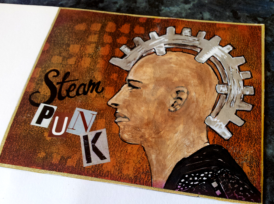
As for my artwork this month, I've kind of messed up as this will mean absolutely zilch to anyone who hasn't read the book - but I can't explain it as it relates to a pivotal scene at the end of the story, which I can't tell you as it would be a big spoiler!


So all you need to know is that is supposed to be Sam Vimes, and he REALLY wants to know where his cow is :)  Oh - and those symbols in the background are dwarvish mining signs which crop up frequently throughout the story:


Sorry to be so vague...... you'll just have to go and read the book for it all to make sense :)

See you again next month, when I'll be reviewing Just My Type by Simon Garfield

Friday, August 02, 2013

Results of an arty collaboration with my buddies....

For a while now, mentions of the Tofu Millenia mail art project have been popping up on a lot of arty blogs - clicking on the link above will take you to a Flickr group with lots of examples.  And Tofu, the artist who started the whole thing off can be found here.

Basically, the concept is that you divide a postcard up into a number of 'strata', and it gets passed around from artist to artist until it's full up.

I kind of had this pegged as something we could maybe do as a project over at Collabor-ART, and maybe we will one day, but in the meantime, one of my pals on facebook suggested we could do a round just between us buddies, and so we did!

We all chose a theme, mine was 'copper and teal' as that's one of my favourite colour combos, and we each arted up the first layer of our postcards (well, I say postcards, we actually agreed to work at a larger size, so most of the participants went for 10"x8", mine was a little smaller).  That's how mine started off up there ^

And this is it all completed, as it came home this week - it looks so cool all filled up:


From top to bottom, me, Carmen, Sami, Jo, Susan and Virginia

And here are the contributions I made to the others:

First of all, Virginia's - her theme was red and black:


I know she loves Celtic imagery, so I drew her this design, based upon an image from the Book of Kells which I have as a tattoo (I had it done back in my Uni days, a long time ago now, when Celtic tatts were all the rage, but I still like it)

Next up - Susie, who went for Steampunk as her theme:

I went for a bit of a pun .... as I don't think there's always enough 'punk' going on in the steampunk trend

Here's my layer along with the other two that had already been filled in at that point, I love how Virginia filled in that heart with loads of tiny, real watch parts:


Jo's rainbow themed postcard was next - we were allowed to choose any colour we liked, they didn't have to be in order a la Richard of York ....  I went for green and painted a pair of envious green eyes:


Next was Sami's - theme 'the motion of the ocean' - most people had gone with fish so I went with an octopus:


And here he is added to the card and embellished a bit in line with the previous additions:


And last, but certainly not least, Carmen's ace Edgar Allen Poe themed card - I was really hoping nobody else would have done something relating to the Tell-tale Heart, as that's my favourite Poe story - and I was lucky....

Here's my contribution:


The quote from the book reads "I admit the deed!  Tear up the planks!  Here, here!  It is the beating of his hideous heart!" - it's kind of supposed to look a bit like it was engraved into the floorboards but I'm not convinced it quite worked, never mind :)

Close up of the heart, smothered in a thick coat of Diamond Glaze - you can see the reflection from my window in it's shine....

I can almost hear it beating .....boom boom boom ..... ;)


And here it is in place with Carmen's poe-tastic postcard now complete:


This was a really fun project, let's do it again sometime girlies!