|
| Front cover of accordion book, belted shut |
Ever the glutton for punishment, I've signed up for yet another new circle journal! (only joking, I love them! and I have another one starting in a couple of months too....)
This one is called Artistic Licence, and it has a great theme. Each participant chooses either a famous artist or an artistic style, and then we all have to create a piece in their book in the manner of that artist / style.
It's going to be a whole heap of fun!
For my theme I was going to go with street art / graffiti as a whole, but one of the other players had already chosen Banksy - so I went more specific and grabbed
wildstyle.
 |
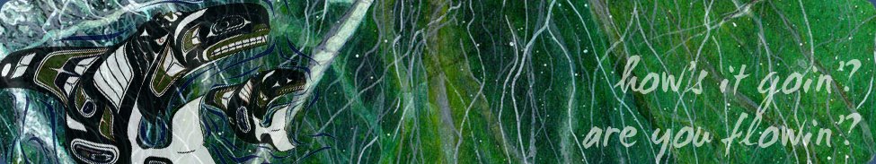
| Wildstyle graffiti |
Wildstyle is the classic old school graffiti, with wonderful complex and elaborate letterforms, sometimes so elaborate they are hard to read! I find this kind of street art - now becoming rarer as stencils and pictorial graffiti are on the rise - absolutely fascinating.
For my book, I've made an accordion book held together with a thick black twill tape, with pages approx 9" x 7", each with a photographic print of a bare wall - just waiting to be adorned :)
Here's a better look at the cover with its belt open:
I hand cut the stencil of the graffiti artist, and used Copics to airbrush him, and his colourful spraypaint, onto the wall.
Here's a side view of the book, you can see all the twill tape that holds the pages together:
The front and back covers were cut from fairly thick corrugated cardboard from a cardboard box, and edged with black ice hockey stick tape (just like 7 Gypsies gaffer tape but a good deal cheaper!!)
The 12 pages (an intro page, 9 participants, and a double wall for sign ins at the back) all laid out took up most of my living room carpet!
 |
| These are the backs of the pages |
In case you are wondering why they are on scrap paper, well, a graffiti CJ wouldn't be complete without spray paint!
Here's what the page fronts look like (well, some of them at least):
 |
| (backgrounds from Sherwood Forlee's "Walls Notebook") |
<===== And here is the intro page (inside front cover)
I drew out that "welcome" freehand, that's probably my favourite bit of the whole book!
As for my actual entry, I used the acetate graffiti artist that I was left with after cutting my stencil for the cover, and painted him black on the reverse side to make a little man embellie.
And the wildstyle letters spelling ART are cut out freehand from Basic Grey papers, and then I drew the shadows in directly onto the wall.
I was pleased with this page until I had a sudden urge (one of those things that seems like a good idea at 2am!) to blob Diamond Glaze rather randomly and messily over the ART letters. I'm not sure that bit works. But otherwise, it'll do :)
And here's my blurb on the back of my wall:
And last but not least, it's traditional with CJs, isn't it, to have a couple of pages at the back of the book where everyone can sign in with tags....
No, not that kind of tag!
THIS kind of tag!
Some people hate this kind of graffiti especially - a wall full of tags (usually a stylised signature or set of initials written quickly with a fat chisel nibbed marker pen) certainly isn't as pretty or striking as most street art.
But I find interest even in these messy walls.
And I'm interested to see what everyone else in the CJ group comes up with for their personal tag.
I think that's everything - sorry for the image overload!!
This book goes out into the world in August. I'm really excited to see what everyone does on their walls :)