Monday, June 27, 2011

Hello! Hello! Hola!


Art Journal pages are like buses, none for weeks, and then two come along at once!

This page (which looks a lot better when it isn't bathed in camera flash flare, sorry about that) is in response to the current prompt over at A Year In The Life Of An Art Journal:

THE PROMPT: Vertigo
THE SONG: Right Round Ft. Kesha
Written Lyrics HERE
PRODUCT/TECHNIQUE: Circles


I had to draw the line at Kesha, sorry.  I took my musical inspiration from the U2 song Vertigo instead.

I'm by no means the world's biggest U2 fan, but I do love this song.  Whenever it comes on the radio I'm hollerin' "HOLA!" with the best of them :)

The page deals with my love/hate relationship with heights....I get a real thrill from looking down from a great height but only if I am standing on something that feels solid and doesn't wobble! :)

AJED : 82/365

A quick journal page

Well you didn't think I would let that test spray on braille paper go to waste, did you???

AJED : 80/365


Sunday, June 26, 2011

I do keep my promises....eventually.... STENCIL TUTORIAL


Way back in March, I promised that I would blog a step by step showing how to make a custom portrait stencil.... and at last, here it is, I hope it was worth the wait!

I asked for suggestions for the subject matter back on the original post, and I selected one at random to cut - I ended up with Salvador Dali (as suggested by Lorraine)

So - where to start?
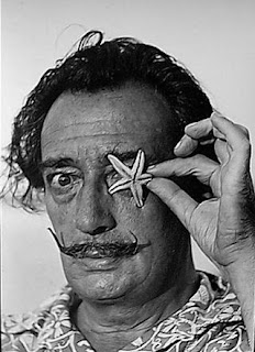
Step 1 - find a photo of your subject matter that will translate well into a stencil.  You want one with good contrast - lots of dark and light areas - a strong composition - and preferably a light background.

Step 2 - using your preferred image editing computer programme (I use Photoshop, but there are many alternatives), change the image to black and white if it's not already monochrome, and then ramp up the contrast heavily.


Step 3 - again, I used Photoshop for the next step - specifically a filter called "Stamp" (see screen shot above) - but any image editing programme will have a way to complete this stage of the process, namely reducing your image to pure black and white.

If you do use the Photoshop filter, you will have the added advantage of the two sliders to the top right of the screen which allow you to fine tune the resulting two-tone image until it looks as good as it can - capturing just the right amount of detail so that your subject is clearly recognisable, without the image being too complex to cut. Here is the resulting filtered image:

Step 4 - the initial filtered image is often a little messy - with lots of little lines and blobs which will be a pain to cut, and which aren't really adding much to the image, so use the paintbrush tool inyour image editing programme to tidy everything up a bit.  My tidied image <----
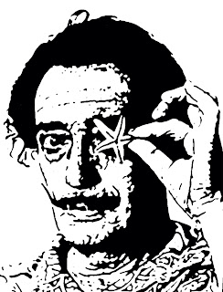

Islands half gone


Step 5 - now we get to the trickiest part - the islands and bridges.  Simply put, you can't have any white islands in your finished image, as they will fall out when you go on to cut out all of the black areas.  So you need to connect all completely enclosed white areas to the outside white border of the image, using a white "bridge"

Take your time with this bit, as it's important to free all of your islands.

 
All islands have now been freed
Step 6 - You are now ready to print out your image, re-sized to the size you want it (don't go too small, or the little details will be too tricky to cut - I printed the Dali image at a height of roughly 6 inches)

Step 7 - if your image ends a little abruptly at the edges, as mine does, you might want to hand draw some extra details in.  Here, I've completed Dali's right shoulder and left forearm.

Step 8 - with masking tape, secure your guide image underneath a piece of glass (mine came from an old picture frame), and then secure a sheet of fairly heavy weight acetate on top of the glass.

Step 9 - now on to the cutting.  You can use a craft knife here, but it is much quicker and easier to use a specialised heat tool.

This is the cutter I have (although I'm sure I paid a lot less than that for it!).  It glides through the acetate like butter, I love it.

The cutting process is pretty straightforward, you simply need to trace over the picture below the glass, cutting out all of the black areas.

Here you can see the image partially cut out:


And here it is all done:


Step 10 - before applying adhesive to the stencil, just hold it down as best you can with masking tape and make a test image - preferably with quick drying spray paint as it's the quickest and easiest medium to test a stencil with - on scrap paper. 

The test image will help you spot if any of the detail areas haven't been cut out properly, or need enlarging.

For example, you can see on the test image below that the detail under Dali's right eye hasn't come out as it should have - it turned out that I hadn't cut that area out fully and so it hadn't popped out.
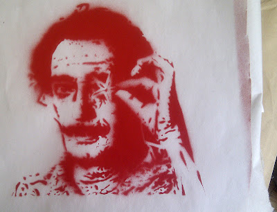
first test spray result

Step 11 - once you have rectified any problems identified from the test image, flip the stencil over and spray it all over the back with repositionable adhesive.

Step 12 - if your spray glue is anything like mine, it dries up way too sticky and not even remotely repositionable (despite the claim to the contrary on the tin)

I find the best way to reduce the adhesive surface to a truly low tack state, is to stick it on my jeans and lift it off again a few times!

Step 13 - we're ready for a second test spray, I used black spray paint this time....


That's better :)

That's it - we're done!

So all that's left to do now is USE your new baby :)

Here are a few ideas....

Distress ink applied with cut n dry foam onto kraft ledger paper:


Copic pens applied using the Copic airbrush system - onto a patterned paper with a photograph of a brick wall (realistic isn't it, one of my facebook friends saw the close up photo from the top of this post and thought I had cut a giant stencil and sprayed Dali onto a real wall!!  :D ) :


Metallic spray paint onto a page from a braille magazine, great texture:


So there we go, I hope you enjoyed this tutorial.

Happy stencilling, everyone!!

Sunday, June 19, 2011

Even angels get the blues....


The Project Runway circle journal is now underway, and this is my entry for the first CJ I have received.

It comes from Kathy in Ireland, and her chosen Project Runway challenge was the one from season 4 where they could use only denim and white cotton to make an outfit for Levi Strauss.

I've used denim from a favourite, but now retired, pair of jeans to make the wings of my very own "stonewashed angel" - and the angel herself is an inkjet image transfer of one of my graveyard photos onto fabric from one of Connor's old white t-shirts, which he had tie dyed so it has a faint blue pattern showing through.

Other nods to the theme are the little Levi-style tab in the title:


And the yellow stitching and halo of antique copper eyelets in place of the rivets on a pair of jeans:


I really like how the image transfer came out, soft and dreamy.

And I also love the happy accident of how the dark spots in the salt background (made in response to a Marit's Summer Camp prompt) worked their way through the acrylic paint that I used to stamp the title, giving it a really great texture....almost like the lichen patterns you so often see on stone angels.  Perfect!

Isn't it great when things work out just right all by themselves.

Saturday, June 11, 2011

Do you know what day it is today?

It's International Yarn Bombing Day, of course.

What do you mean, you didn't get the memo?

I really wanted to join in, but I can't knit!  (or crochet)

So I thought, what else can I do with a ball of wool?  Pom poms of course!


So I made up a few this afternoon:


...and then we headed out to find somewhere to put them....

After a little bit of thought, the perfect spot became obvious....the statue of the bathers over by the Link Centre....

One of the poor chaps seems to have lost his nose:


I'm sure I can help him with that....


That's better :D


His two friends got nose jobs too:


Here's hoping they bring a smile to somebody's face

By next year, maybe I'll have got the hang of knitting?

Thursday, June 09, 2011

I know pride's a sin, but, sorry, I'm proud of this!

I actually painted something, from scratch, that looks roughly like its subject matter! yay me! :)

So....this is a circle journal entry for the Blue CJ in the colours circle - my last contribution to this particular circle, now I just have to sit tight and wait for my own book to come home.

As I'm the last to work in this book, most of the obvious takes on the colour blue had already been nabbed, so I was wondering what to do.....and at the same time I was looking to up my participation in Marit's Summer Camp - an online community I have signed up to for the next few months.

One of Marit's prompts revolves around producing a piece of work in three parts - a triptych.  This reminded me of this Octopus painting, by "Plantation Design", that I had seen on Pinterest.

Fab isn't it?

I do hope they don't mind me taking inspiration from their design, it's not for profit after all, and I am not for a second taking credit for the idea.  Please don't send your copyright lawyers after me, plantationdesign.com!

So, anyway, I drew up a sketch that fitted the dimensions of the circle journal:

(sorry for the bad photo)
And then transferred the basic design in plain white paint to a dark blue painted background:


An unintended but cool effect, the white paint crackled over the waxy ink mixture I had used to stamp the circles on the background, serendipity :)

Next I played with different ways of painting in the little suckers on the pus's tentacles, in the end I settled for stamping little circles with the end of a mechanical pencil:


And then it was just a case of adding some shading:


and finishing off the tentacles, and then it was all done:


Sorry this is a bit image heavy....but hopefully it's interesting to see how it all evolved.

All that was left to do was slice the picture up into three parts, and machine sew around each section.

They were added to a bubbly background (another technique from Summer Camp), and a stamped title finished off my CJ entry:


I love it! I really do!  It's such a nice feeling to be genuinely pleased with something I've made :)

Here's a close up of that bubble background:

And here are the pages in situ in the completed book:


That's it, I'll stop boring you with octopus photos now! :)


Monday, June 06, 2011

None for ages, and then two come along at once....


I think there must have been a hold up down the line on the Colours CJ I'm a part of, as I haven't had a book for months....but then this week I got two at once - Turquoise and Blue - these are the last two books I am due to work in and then I'm all done with this particular circle.

I finished Turquoise today, and Blue is well on its way. It's always kind of sad when a circle comes to an end, but I'm looking forward to getting my own book (Black) back soon.

Turquoise is a lovely gemstone and one I like to use in jewellery - especially with copper - so my page is about the stone more than it is about the colour.


I made a pair of earrings to go with the page - I do hope the CJ owner Jane has pierced ears :)  And attached them to my sign in tag through little eyelets

Here's the page and tag together in the book:


It's a pity you can't really see the background clearly in these photos, there's all sorts of things going on there, tone on tone stamping and glimmer mists and stuffs....but you will just have to imagine those bits :)

Off to finish Blue...... catch you later alligators......