


 ....as Sir Timmy would say.
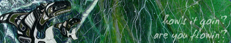
Here's my entry in Willow's tattoo CJ.
The theme of it is "a tattoo tour" - and basically the idea is similar to Ann's CJ that I did last month - it's a "show me all your tattoos" type thing - but the vibe is less scrapbooky and more artsy/collage.
So that meant that despite the similar theme it really did feel like doing something totally different. And it was mucho fun.
I know I say that about virtually everything :D But I really DO have so much fun making stuff - it's like being in pre-school again :)
I started this one off by cutting lots of relevant words and phrases from some old tattoo mags and sticking them onto some DCWV 'Far East' paper, more for the texture than the pattern as it was going to be fairly well covered up:

Then I toned it all down with some scraped on gesso, and added a wash of yellow, orange, red and purple acrylic paints:

The background was finished off by stamping with a GPP corrugated cardboard style stamp in brown chalk ink and edging with deep purple distress ink (I don't have a separate pic of that stage but you can see it clearly enough in the main photo above)

The lady is an image transfer of an inkjet print onto watercolour paper using Stewart Superior Transfer Ink (I love the soft quality of these transfers), coloured with watercolour pencils.
I cut stencils in a post it note for the crosses (which mark the locations of my five tattoos) and the dotted lines, and used chalk ink cats eyes DTP through the stencils to decorate her.
The road sign (Viva Las Vegas stamps) was stamped onto some Basic Grey spotty paper, watercoloured with brown dye ink and a waterbrush, and covered in crackle glaze.
The shrink plastic bird (Tim Holtz) is completely irrelevant but I had it lying around and thought it looked good :)

I printed pictures of my tattoos on transparency, cut them out using a stencil cutter (heat tool), and stained the edges with brown ink to make it look like they had been burnt. Each of these was tied onto the background using brown waxed thread.
To each of the pockets, I tied a tag which had been sprayed with orange and red glimmer mists, which explained a little about each tattoo.
I didn't go into huge detail though, as I figured that everyone who sees this will also have seen the layout I did in Ann's CJ, which has a little more info.
There is a swipe of titan buff paint behind each transparency just to make the tattoo pics clearer to view when the tags are out.

And the title "Take the Grand Tour" was cut in an art deco font on my Cricut (via SCAL software), painted with Aged Mahogany crackle paint, and then highlighted after drying with gold rub n buff to highlight the cracks.
And that's about it for that one. Can't wait to receive the next journal :)


3 comments:
I love this entry! I am so inspired by all of the layering, painting and spraying. I am sure you had the best time, and got really inky! Great way to show the tatoos, I love the effect of your burning tool, especially with the extra inking. Great stuff!
your entries are awesome
WOW- a masterpiece!
Post a Comment