


Sorry Eddie and the boys, if you're reading this - I do love the music on it, but not the avocado photo so much.
So, anyway, this is my entry in my own CJ for the just-about-to-start Rock Resurrection circle journal. I left it a bit last minute as posting date is tomorrow (in fact, it's past midnight now, so it's today!)
The theme of my journal is to design a new album cover for an album you love, that has a cover you don't so much.
So, yes, I went with Pearl Jam's infamous Avocado album:

Now, don't get me wrong, I don't hate everything about it. I do like the strong blue colour background contrasting with the yellowy flesh of the avocado - and I've carried that colour scheme over to my own version, kinda. I also don't hate the font or style of the lettering, and I've gone a bit similar with that too.
But I plain and simple don't understand WHY an avocado???? It doesn't seem to have the slightest connection to anything on the album at all.... plus I hate guacamole. ugh.
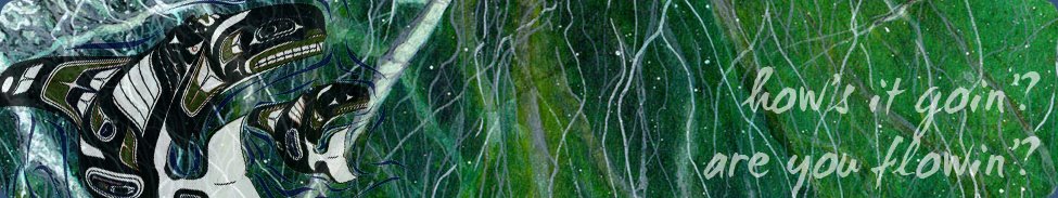
So I started brainstorming alternatives, and as a few of the songs on the album are ocean-related (Big Wave, Marker In The Sand etc), and Eddie is well known for his love of surfing, I started thinking of different ways to illustrate the word wave, and, well, this is what I came up with:

There are three "waves" on there - the waving hand (which could be the severed hand referred to in another song title maybe?), the blue ocean waves themselves, and the oscillating wave diagrams stamped faintly onto the bottom-most blue paper.
The book page used for the text based blue paper is also wave related, as it is about building a canoe.
The hand is a rubber stamp I picked up years ago - sorry I can't remember the name of the manufacturer - I love how clearly it stamps the details.
Here's the back of the album cover, featuring a gel medium image transfer of the boys themselves, and the track listing:

As far as I'm concerned, my cover blows the avocado out of the water, what do you reckon? :)
This all gets posted off tomorrow, and in 10 months or so it will hopefully come home with 9 more made-over record sleeves. I'm really excited to see what everyone else comes up with!


9 comments:
Sarah it's absolutely gorgeous I love it! Can't wait to get my hands on it if I'm honest and that stamp is divine!
I love your album cover WAAAAYYY better than the original! WOWZAH!!! And it is such a cool theme for a circle journal!
Love the hand, you are so creative!!
xx Tessa
You know what? This is totally how the album should've looked!! I LOVE the back cover - especially the image transfer - very cool and so crisp!!
Hope you're well and happy Sarah! =D
I say see ya avocado! I like yours so much better and altho' I've never heard the album the maudlin song titles really appeal to me. penny
Actually Sarah, your album cover does indeed beat the original - perhaps you should emial the band with a link to this post and invite them to come see! You may get to design their next one?
What is UP with the avocado on the album cover?
But Sarah, they are SO good for you. I'd really like to hear that you learn to love guacamole for the skin benefits alone!! LOL
Your cover is way more fun. If I see Eddie anytime soon, I'll be sure and ask him about this!!
I wonder if you dare put a link to your post on the Pearl Jam facebook page...
I did a post on Joan Jett once and they were really cool when I shared it with her fans...
awww no TJ I wouldn't want them to know I was dissing the avocado! :D
thanks for all your comments tonight, much appreciated - glad you liked "I Am Mine", probably one of my favourite things I've made in a long time
Post a Comment